For almost two years now I have been working on a non-Miva Merchant project that has truly been out of my comfort zone. I must also humbly apologize to all of graphic artists that I know, admire and aspire to be like.
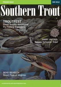
Back in December 2011, I partnered with my in-laws to form Southern Unlimited, LLC and launch Southern Trout with the goal to produce a digital online magazine that covers everything related to trout fishing in the southeast. The project was the brainchild of my father-in-law, Don Kirk, a renowned outdoor writer whose works include the The Ultimate Fly-Fishing Guide to the Smoky Mountains,Fly-Fishing Guide to the Great Smoky Mountains,
Smoky Mountains Trout Fishing Guide,
and his latest release Flyfisher’s Guide to Tennessee.
This would be the perfect venue for his knowledge.
Building the website for the project was the “easy” part. Creating the “brand” for Southern Trout was the first must-do task to tackle. While I understand the concept of branding, being able to creating the design for it was one of the first of many challenges that I would have to rise to. The logo and color schemes would be what people would come to recognize us by, so it would need to be memorable. Besides making graphics for the web, they would also need to be print quality. I am fortunate to have worked with a number of graphics artists throughout the years and learned the differences between RGB and CMYK, DPI and resolutions.
The real challenge would come when it was time to layout the first edition of Southern Trout. I had never used another “design” tool other than Photoshop, so learning InDesign was a challenge. Thank goodness for all the generous people that have graciously shared their tips and tricks online. With each edition of the magazine, I have tried to learn a new trick or do something just a bit different. I also continue to study print magazines trying to learn the styles of others. All I have to do is figure out how to layout all the articles, images and advertisements into something visually appealing. I trusted the content that the writers would provide would speak for itself.
 The first edition of Southern Trout went online around the first of May 2012 and was 68 pages. As a fledgling start up business, we agreed to publish the magazine every other month. The magazine would be supplemented with the website, a newsletter, Facebook, Twitter, Pinterest, Flickr, FourSquare and any new way to get the word out. Some of most fun I have had has been getting out to events to promote the magazine.
  We stayed in a beautiful bed & breakfast in Virginia aptly named The Speckled Trout while attending the Virginia Fly Fishing and Wine Festival.
Each layout is almost like putting together a puzzle but without the box cover to see what it should look like when finished. Placing the images within each article, trying to figure out how to make the images pop and not have a cookie cutter look to it. Couple that with inserting ads in a variety of sizes, it gives me a continuing appreciation for all the graphic artists I have worked with over the years.
A digital magazine has it’s pluses when it comes to deadlines, they can be stretched a bit. Also you have the ability to go back and fix little things, but it’s not like the quick fixes of a website. The digital magazine is published to the website using an application that converts all the PDF pages from InDesign into versions that are compatible for a wide range of viewing devices. It does all the heavy lifting creating Flash and HTML.
 On October 1, 2013 we published our 9th Edition of Southern Trout – with more article and many more pages – I laid out 202 pages from cover to cover!


